
We have rebranded as NowShenzhen.com with a new logo
By Nowshenzhen · November 2, 2020 · 2 min read · 👁 1,420 views
We have a new brand! Over the last few months we have rebranded as NowShenzhen.com. As we have rebuilt the website we have been thinking of the design of our new logo.
Luckily we were able to go back to the original designer and founder of the site Matthieu Charlier to commission the new design. Since we designed the original logo Matthieu has become an expert in product design and innovation working for some very high-profile clients including Apple. He gave many options and we narrowed them down through community involvement.
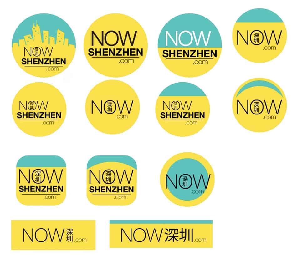
Initial options for logo
After getting community feedback on the above designs and internal discussions, we came up with some additional options to narrow down the choices.
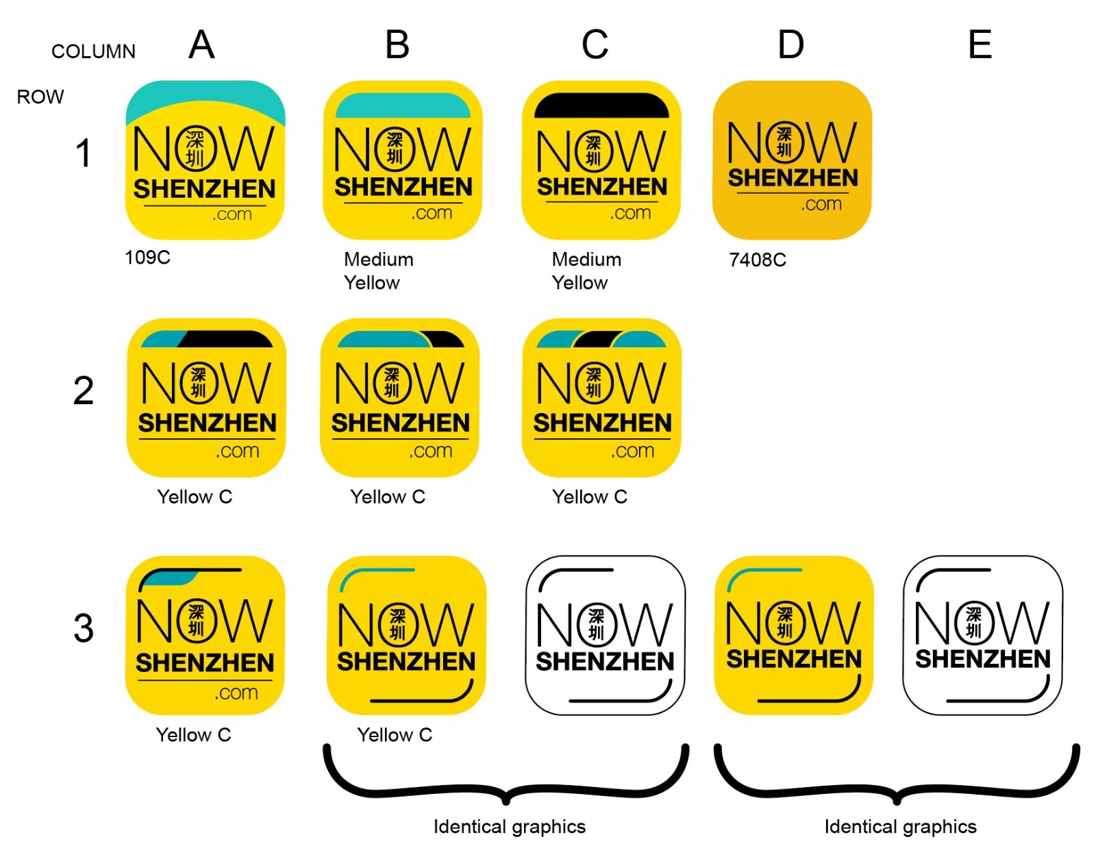
Now Shenzhen Logo Choices
The final logo we chose is below:

The new Now Shenzhen Brand logo
As Shenzhen celebrates its 40th Anniversary we thought it would be best to modernize the logo as the city has modernized. When we originally designed our old logo when the Diwang building was the 6th tallest skyscraper in the world. Today Shenzhen has taller buildings such as the Ping An Finance tower. It was time to go a bit more abstract and leave the night scene in the past.
Now you see our new brand matches how Shenzhen and internet technology has expanded. We have grown up over the past 19 years expanding on the sections we cover.
We wanted to change to a color scheme that would be more attractive to the millions of business travelers that come through Shenzhen on a yearly basis.
The logo also indicates how we keep our channels updated on a daily basis as over the years in order to cover the “Shenzhen speed” our content publishing frequency had to increase.
Chinese characters (深圳) for Shenzhen included in the logo call to the 15% of Chinese users that visit our properties regularly. A literal definition of the Chinese characters for “Shenzhen” is deep drains and thus we have two lines in the logo one black and one blue that guide the eye and represent the water that once flowed through the fields of Shenzhen.
This logo will look good in future digital ventures as well as on the rugby t-shirts and event flyers. If you want to get more exposure for your events or sports team just email us to be part of our media partnership program and we can help promote your events on our event calendar.
Again, really want the thank Matthieu for supporting the redesign.
Resources
Keep reading
All in Articles
Obsidian Bar: Forged in Shenzhen, Rising Through Asia
Obsidian, black volcanic glass was where it all began. That single, striking image sparked the vision for everything that followed. Grounded in a...

Why China’s International Schools Build Stronger School Communities
Having taught in international schools in China and academies in Britain, I have seen how much a child gains when school and home share a clear...
PLH Fitness Club: Fitness by the Beach
Most big cities boast a wealth of established, committed clubs. Xiaojingwan is a lot smaller, a holiday destination with only a handful of clubs to...